The graphics forum (images and design) - self explanatory really!
Moderator: Core Staff
-
Cr@sh
- CJ Wannabe

- Posts: 22
- Joined: October 18th, 2006, 1:59 am
Post
by Cr@sh » November 19th, 2006, 9:32 pm
-
Soviet
- Core Staff

- Posts: 7762
- Joined: April 23rd, 2005, 9:12 pm
Post
by Soviet » November 19th, 2006, 9:59 pm
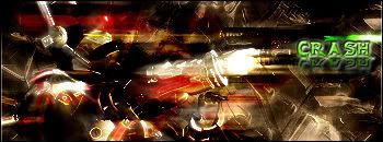
i love the first one, dont care much for the others
-
Pedsdude
- Site Admin

- Posts: 15915
- Joined: October 15th, 2004, 7:18 pm
- Location: UK
Post
by Pedsdude » November 19th, 2006, 11:18 pm
Yeah, although the third one is quite good also.
-
Cr@sh
- CJ Wannabe
- Posts: 22
- Joined: October 18th, 2006, 1:59 am
Post
by Cr@sh » November 20th, 2006, 4:02 am
thnx
-
Drofder2004
- Core Staff
- Posts: 13315
- Joined: April 13th, 2005, 8:22 pm
- Location: UK, London
Post
by Drofder2004 » November 20th, 2006, 4:42 pm
Need a lot of practice with text, also, if you can create sigs like those why is your sig so basic :S
 Virgin Media 20Mb Broadband:
"Perfect for families going online at the same time, downloading movies, online gaming and more."
Borked internet since: 22-07-2010
-
Ownia
- Past/Inactive Team Member

- Posts: 1117
- Joined: November 11th, 2004, 4:24 pm
- Location: Tallinn/Estonia
-
Contact:
Post
by Ownia » November 20th, 2006, 6:38 pm
and so big
-
[SoE]_Zaitsev
- Core Staff
- Posts: 14220
- Joined: October 21st, 2004, 7:17 pm
- Location: Holland
-
Contact:
Post
by [SoE]_Zaitsev » November 20th, 2006, 6:39 pm
I like the Link sigs, being a Zelda geek myself you used pretty old versions of him.
The third one with the TP is pretty sweet though.
matt101harris wrote:big cock was the first thing that came to my head lol
-
waywaaaard
- Core Staff
- Posts: 2214
- Joined: February 6th, 2006, 3:18 pm
- Location: Germany/Bayern
Post
by waywaaaard » November 20th, 2006, 9:53 pm
teh first one is not bad only a little bit to huge
the second one ist also good but the font and the style of the font destroys the whole sig
the other are nothing great; the need more work or ideas
THAT HANDS WERE NOT TRACED!
visit my blog:
Link
Soviet wrote:Yeah, watch out, Peds will hit you with his +5 D-Battleaxe of homosexuality 
-
Cr@sh
- CJ Wannabe
- Posts: 22
- Joined: October 18th, 2006, 1:59 am
Post
by Cr@sh » November 21st, 2006, 2:24 am
yea, i need to switch out my sig now with a better one...like the 1st one. im too lazy (it takes 13 seconds)
-
Pedsdude
- Site Admin
- Posts: 15915
- Joined: October 15th, 2004, 7:18 pm
- Location: UK
Post
by Pedsdude » November 22nd, 2006, 6:33 pm
Drofder2004 wrote:Need a lot of practice with text, also, if you can create sigs like those why is your sig so basic :S
The text in my designs also happens to be shit, which is a shame because I think the text makes grapics - take the CoDJumper.com logo at the top of this page for example, the text looks professional and stands out, I would like to be able to make text like that

-
Soviet
- Core Staff
- Posts: 7762
- Joined: April 23rd, 2005, 9:12 pm
Post
by Soviet » November 22nd, 2006, 7:01 pm
im almost positive thats Far Cry font. After that just add a wave to it and some horizontal distortion and BOOM, theres your text

But peds is right, even the simplest text can be perfect for a sig. Ive spent hours just trying to find good text for one of my sigs before (and sometimes havent found it

)
-
Cr@sh
- CJ Wannabe
- Posts: 22
- Joined: October 18th, 2006, 1:59 am
Post
by Cr@sh » November 23rd, 2006, 3:16 am
yea, ill need to work on that
what are everyone favorite fonts?
-
Nightmare
- Core Staff
- Posts: 2688
- Joined: January 12th, 2006, 10:09 pm
-
Contact:
Post
by Nightmare » November 23rd, 2006, 3:37 am
-
Cr@sh
- CJ Wannabe
- Posts: 22
- Joined: October 18th, 2006, 1:59 am
Post
by Cr@sh » November 23rd, 2006, 3:49 am