The graphics forum (images and design) - self explanatory really!
Moderator: Core Staff
-
Pedsdude
- Site Admin

- Posts: 15915
- Joined: October 15th, 2004, 7:18 pm
- Location: UK
Post
by Pedsdude » November 22nd, 2005, 10:03 pm
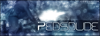
Created one for PedsDesign.com just testing about with blending options:

Created one for a friend of mine's clan:

-
Soviet
- Core Staff

- Posts: 7762
- Joined: April 23rd, 2005, 9:12 pm
Post
by Soviet » November 23rd, 2005, 3:02 am
very nice, simple, but sometimes simple is good
-
Monkey
- Past/Inactive Team Member

- Posts: 670
- Joined: December 8th, 2004, 2:49 pm
- Location: uk
-
Contact:
Post
by Monkey » November 23rd, 2005, 11:13 am
the first one is v v nice, and yeah i agree with soviet

-
Neon
- Too cool for CoDJumper

- Posts: 3535
- Joined: April 21st, 2005, 8:54 pm
- Location: England, Redditch
Post
by Neon » November 23rd, 2005, 12:38 pm
is the second one a logo or a banner? cuz its a big logo otherwise...but very nice


"If we can hit that bull's-eye, the rest of the dominoes will fall like a house of cards...Checkmate."
"Seriously... .45k/sec it is a joke.. I could have just gone out and taken my own photos of children in this time."
"You have just become my fave youtuber!" - KillerSam in regards to myself. Win.
-
Drofder2004
- Core Staff
- Posts: 13315
- Joined: April 13th, 2005, 8:22 pm
- Location: UK, London
Post
by Drofder2004 » November 23rd, 2005, 4:25 pm
I personally dont like the 1st one, but the second one is excellent.
 Virgin Media 20Mb Broadband:
"Perfect for families going online at the same time, downloading movies, online gaming and more."
Borked internet since: 22-07-2010
-
Pedsdude
- Site Admin
- Posts: 15915
- Joined: October 15th, 2004, 7:18 pm
- Location: UK
Post
by Pedsdude » November 23rd, 2005, 9:02 pm
The first one I was trying to make something simple but abstract, like a company logo or something.
The second one i was just making a banner for a friend's clan. I have made a logo for him, but it's not that good so I won't post it
-
Soviet
- Core Staff
- Posts: 7762
- Joined: April 23rd, 2005, 9:12 pm
Post
by Soviet » November 23rd, 2005, 9:40 pm
you must post your failures as well as your sucesses so we can help to point out the flaws we see, as well as the flaws you see, so you can get better...and so we can laugh at you
-
Pedsdude
- Site Admin
- Posts: 15915
- Joined: October 15th, 2004, 7:18 pm
- Location: UK
Post
by Pedsdude » November 24th, 2005, 3:16 pm
*sigh* fine

-
Soviet
- Core Staff
- Posts: 7762
- Joined: April 23rd, 2005, 9:12 pm
Post
by Soviet » November 24th, 2005, 4:40 pm
thats not bad, thats good. I like it.
-
Neon
- Too cool for CoDJumper
- Posts: 3535
- Joined: April 21st, 2005, 8:54 pm
- Location: England, Redditch
Post
by Neon » November 24th, 2005, 7:11 pm
yeah i like that
"If we can hit that bull's-eye, the rest of the dominoes will fall like a house of cards...Checkmate."
"Seriously... .45k/sec it is a joke.. I could have just gone out and taken my own photos of children in this time."
"You have just become my fave youtuber!" - KillerSam in regards to myself. Win.
-
Pedsdude
- Site Admin
- Posts: 15915
- Joined: October 15th, 2004, 7:18 pm
- Location: UK
Post
by Pedsdude » November 26th, 2005, 12:34 pm
meh, ok
-
Drofder2004
- Core Staff
- Posts: 13315
- Joined: April 13th, 2005, 8:22 pm
- Location: UK, London
Post
by Drofder2004 » November 27th, 2005, 11:26 am
So Peds, what did you think was wrong with the logo, it looks fine to me.
Virgin Media 20Mb Broadband:
"Perfect for families going online at the same time, downloading movies, online gaming and more."
Borked internet since: 22-07-2010
-
Pedsdude
- Site Admin
- Posts: 15915
- Joined: October 15th, 2004, 7:18 pm
- Location: UK
Post
by Pedsdude » November 27th, 2005, 1:36 pm
Hmm, well first of all with the top cloud bit there are bits at the top and bottom where there's a white opaque line, which I didn't mean to happen.. Secondly I thought the text was a bit too basic, could maybe do with snazzing up a bit more (both bits of text) and finally I did the top cloud bit and the bottom cloud bit seperately, and they aren't the exact same colour (I notice it every time when I look at it) - the bottom cloud is more blue, the top is more turquoise.
-
Neon
- Too cool for CoDJumper
- Posts: 3535
- Joined: April 21st, 2005, 8:54 pm
- Location: England, Redditch
Post
by Neon » November 27th, 2005, 4:02 pm
o yer i notice the colour difference now, tht shard to see tho
"If we can hit that bull's-eye, the rest of the dominoes will fall like a house of cards...Checkmate."
"Seriously... .45k/sec it is a joke.. I could have just gone out and taken my own photos of children in this time."
"You have just become my fave youtuber!" - KillerSam in regards to myself. Win.
-
Drofder2004
- Core Staff
- Posts: 13315
- Joined: April 13th, 2005, 8:22 pm
- Location: UK, London
Post
by Drofder2004 » November 29th, 2005, 2:31 am
Pedsdude wrote:Hmm, well first of all with the top cloud bit there are bits at the top and bottom where there's a white opaque line, which I didn't mean to happen.. Secondly I thought the text was a bit too basic, could maybe do with snazzing up a bit more (both bits of text) and finally I did the top cloud bit and the bottom cloud bit seperately, and they aren't the exact same colour (I notice it every time when I look at it) - the bottom cloud is more blue, the top is more turquoise.
Now you have pointed them out, I can see the problem

Virgin Media 20Mb Broadband:
"Perfect for families going online at the same time, downloading movies, online gaming and more."
Borked internet since: 22-07-2010