Possible new forum design

General chat area for anything whatsoever

Moderator: Core Staff

Pedsdude
Site Admin
Site Admin
Posts: 15914
Joined: October 15th, 2004, 7:18 pm
Location: UK

Possible new forum design

Post by Pedsdude » November 2nd, 2007, 1:58 am

I've been having a play around with the forum theme (you will have noticed I replaced the 'CoDJumper.com' background with the dark grey stripes), and have come up with the following possible design:

Image

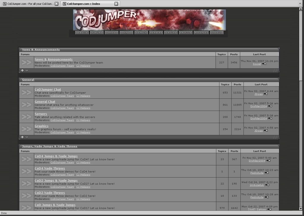
What do you think of this design?

If people like it, I'll try and implement it over the next few weeks, although it won't be an easy takes - I edited a single .html page which was a copy of the main forum page (if you follow me), which isn't the same as phpBB, so it is likely to be quite a challenge.
Image
Image

User avatar
Nightmare
Core Staff
Core Staff
Posts: 2688
Joined: January 12th, 2006, 10:09 pm
Contact:

Post by Nightmare » November 2nd, 2007, 3:31 am

Looks good except the blue in there doesn't match at all with the black and grey stripes in the background.
Maybe matching them up a bit so they look alike more?
Coding is Poetry. Mapping is Art.
"Cause im the sexiest mapper ever...except for nm, that sexy man" - Soviet

-=[CoDJumper.com Movies]=-
[Ambush] || [Backlot] || [Bloc] || [Bog] || [Broadcast] || [Chinatown] || [Countdown]
[Crash] || [Creek] || [Crossfire] || [District] || [Downpour] || [Killhouse] || [Overgrown]
[Pipeline] || [Shipment & Wetwork] || [Showdown] || [Strike] || [Vacant]

JDogg
Too cool for CoDJumper
Posts: 3617
Joined: August 28th, 2007, 11:46 am
Location: Melbourne, Australia

Post by JDogg » November 2nd, 2007, 5:54 am

Looks awesome, Maybe a new header image, something CoD4 esque
Image
Image

User avatar
Drofder2004
Core Staff
Core Staff
Posts: 13315
Joined: April 13th, 2005, 8:22 pm
Location: UK, London

Post by Drofder2004 » November 2nd, 2007, 6:34 am

1. New banner required (as suggested, a CoD4 style) [Banner contest anyone?]
2. New Buttons (Darker)
3. New style forum, greyer and more modern.

I'm guessing the forum doesn't need stretching, this is just screened on a widescreen setup, correct?
Image
Virgin Media 20Mb Broadband:
"Perfect for families going online at the same time, downloading movies, online gaming and more."
Borked internet since: 22-07-2010

User avatar
Drofder2004
Core Staff
Core Staff
Posts: 13315
Joined: April 13th, 2005, 8:22 pm
Location: UK, London

Post by Drofder2004 » November 2nd, 2007, 7:21 am

Example of how I would see it...

Choppy Edit, very quick edit, have removed text and banner would also be changed. Colour would be a lot smoother, but you get the idea).
http://i17.photobucket.com/albums/b88/d ... xample.jpg
Image
Virgin Media 20Mb Broadband:
"Perfect for families going online at the same time, downloading movies, online gaming and more."
Borked internet since: 22-07-2010

User avatar
aicaramba
Past/Inactive Team Member
Posts: 2720
Joined: May 31st, 2005, 3:45 pm
Location: zeeland (N-Br), Holland

Post by aicaramba » November 2nd, 2007, 10:14 am

Sorry, but I really dont like the gray and the blue'ish like this. They just dont go along.
P.S.V. Kampioen!

User avatar
Drofder2004
Core Staff
Core Staff
Posts: 13315
Joined: April 13th, 2005, 8:22 pm
Location: UK, London

Post by Drofder2004 » November 2nd, 2007, 11:04 am

Example part 2
Image
Image
Virgin Media 20Mb Broadband:
"Perfect for families going online at the same time, downloading movies, online gaming and more."
Borked internet since: 22-07-2010

User avatar
aicaramba
Past/Inactive Team Member
Posts: 2720
Joined: May 31st, 2005, 3:45 pm
Location: zeeland (N-Br), Holland

Post by aicaramba » November 2nd, 2007, 11:07 am

drof's 2nd ftw ;)
P.S.V. Kampioen!

JDogg
Too cool for CoDJumper
Posts: 3617
Joined: August 28th, 2007, 11:46 am
Location: Melbourne, Australia

Post by JDogg » November 2nd, 2007, 12:04 pm

Drofder2004 wrote:Example part 2
Image
Looks alot more modern, and the colors blend well, nice header too
Image
Image

User avatar
St.Anger
Past/Inactive Team Member
Posts: 431
Joined: November 7th, 2005, 3:28 pm
Location: Den Hague - Netherlands
Contact:

Post by St.Anger » November 2nd, 2007, 12:42 pm

Drofder2004 wrote:Example part 2
Image
I give my vote to this one.. Looks very nice and simple!!
St.Anger [TW]

Image
Image

GoldenEye
CJ Fan
CJ Fan
Posts: 183
Joined: August 26th, 2006, 8:08 am
Location: Finland

Post by GoldenEye » November 2nd, 2007, 12:46 pm

Part 2 looks really nice.
Image

User avatar
YaNo
CJ Worshipper
CJ Worshipper
Posts: 460
Joined: May 5th, 2005, 9:34 pm
Location: Azeroth
Contact:

Post by YaNo » November 2nd, 2007, 12:51 pm

i rather peds idea, just change the blue of the forum in dark green or something, so it matches the site.

atze<3
CJ G0D!
CJ G0D!
Posts: 1587
Joined: January 3rd, 2006, 9:38 am
Location: Germany

Post by atze<3 » November 2nd, 2007, 2:51 pm

I also like Drofder's second example most, but this bright grey in the middle is ugly :s

Pedsdude
Site Admin
Site Admin
Posts: 15914
Joined: October 15th, 2004, 7:18 pm
Location: UK

Post by Pedsdude » November 2nd, 2007, 3:32 pm

Nice idea Drofder. I'm guessing that everyone is OK with the 2nd theme then?

What about having the 2nd theme, but also adding the vertical grey bars down the sides and darker background either side of them (to suit the main site).

And yes, I'm on widescreen.
Image
Image

topher
CJ Spammer!
CJ Spammer!
Posts: 742
Joined: December 4th, 2005, 9:17 am
Location: OK
Contact:

Post by topher » November 2nd, 2007, 7:06 pm

yea the 2nd theme is nice. :wink: I donno if the vertical grey bars would look good or not with it.
Image

Post Reply

Who is online

Users browsing this forum: No registered users and 2 guests