Adding to Sov:
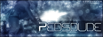
Animation is a "muzzle flash", you should add a light effect on the sig and especially on the render in the sig. So, make the sig go brighter (or higher gamma) and even more so on the fron of the render.
The white sig is screaming out for some solid black text.
I don't think the fourth is missing anything, I actually think the text is ruining it. Make the text small and concise.
My only general advice is to try not an center any renders, using the "
rule of thirds" of photography [seperate you image using rulers at 33% and 66%, on both vertical and horizontals, and then place you focal points on the intersections of the image. In general use, this will always be more pleasing to the eye]. Others positions are "part on, part off" like mine and Soviets sig, with renders on the sides.