Page 1 of 9
Im gettin there...
Posted: April 30th, 2009, 12:56 am
by .:iSpawn:.
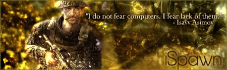
lol gettin a lil better, heres somethin i did today...
With or without quote? I needed something to fill space and couldnt find anyting.
the more i look at them im startin to think w/out..
EDIT: Just noticed it seems like thers a line down the center, fixing now...

OR

Re: Im gettin there...
Posted: April 30th, 2009, 1:04 am
by .:iSpawn:.
Thanks, I accidently merged the render w/ background, so i gotta think on how to make that blend more w/ the colors and stuff of everything else... anyway, i am improving! lol if ya go back n look at my older 1s you will cry compared to this.
Thanks for the comment
Re: Im gettin there...
Posted: April 30th, 2009, 1:41 am
by Soviet
KillerSam wrote:.:iSpawn:. wrote:Thanks, I accidently merged the render w/ background, so i gotta think on how to make that blend more w/ the colors and stuff of everything else... anyway, i am improving! lol if ya go back n look at my older 1s you will cry compared to this.
Thanks for the comment
Did you make your current sig?
I made it
With the text, lower the opacity a bit. Lose the emboss, put a 1px border. The left hand side is a little blurry for my tastes. Make the color of the render match a little more with the background. Other than that, looks very good.
Re: Im gettin there...
Posted: April 30th, 2009, 12:59 pm
by [SoE]_Zaitsev
Use the iSpawn name Soviet made. Yours is just plain text, I like the original one more

Re: Im gettin there...
Posted: April 30th, 2009, 1:59 pm
by Drofder2004
Soviet wrote:Lose the emboss, put a 1px border.
That would be the best place to start

Re: Im gettin there...
Posted: April 30th, 2009, 11:14 pm
by .:iSpawn:.

????????????
meh border looked darker when i was making it
Re: Im gettin there...
Posted: April 30th, 2009, 11:18 pm
by .:iSpawn:.
.:iSpawn:. wrote: meh border looked darker when iw as making it

Any better?
Re: Im gettin there...
Posted: April 30th, 2009, 11:18 pm
by Soviet
The quote text sucks, everything else rocks. Make the text that yellow color, lower the opacity about 20%, and give it a black outer glow.
Re: Im gettin there...
Posted: April 30th, 2009, 11:25 pm
by .:iSpawn:.

Its commin around....
Re: Im gettin there...
Posted: April 30th, 2009, 11:27 pm
by Soviet
darker yellow, more of the orangy color behind the middle of your name. Also, less opacity.
Re: Im gettin there...
Posted: April 30th, 2009, 11:34 pm
by .:iSpawn:.
Photobucket wont load on my browser right now, i changed yellow and my name at bottom, ill post later. Thanks so much!
Re: Im gettin there...
Posted: April 30th, 2009, 11:35 pm
by WorldDomoNation
I don't really know much about graphic design, but imo i would somehow integrate that quote a little better. Maybe blend it in with the background a little.
Re: Im gettin there...
Posted: May 1st, 2009, 12:23 am
by .:iSpawn:.
I think i Like it the way I have it right now. Although somethings gone freaky w/ my photobucket... ill be sure to get it up later tho when it works. XD Thanks again for all the help
Re: Im gettin there...
Posted: May 1st, 2009, 12:40 am
by .:iSpawn:.
Finished? Im likin it
Re: Im gettin there...
Posted: May 1st, 2009, 12:45 am
by Soviet
looks good enough for me.