Page 1 of 1
Another new one.
Posted: October 28th, 2005, 11:56 am
by JammY
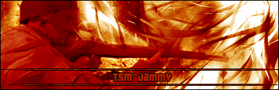
got some new brushes off of deviantART.com. What do y'all think??

Posted: October 28th, 2005, 1:07 pm
by Soviet
once again, the brushwork is awesome, but also once again the text can be difficult to read
Posted: October 28th, 2005, 1:52 pm
by Drofder2004
Soviet wrote:once again, the brushwork is awesome, but also once again the text can be difficult to read
Yet again I agree.
Some thing needs too be done with the text. Maybe a bit plain, or a bold border. Not sure, but it looks class.
Posted: October 28th, 2005, 5:04 pm
by Pedsdude
Looks very nice indeed. As drofder said, the text is bit unclear.
Posted: October 28th, 2005, 5:08 pm
by JammY
Damn text. Lol. I need to get some tips for the fonts. TY for the feedback.
Posted: October 28th, 2005, 5:19 pm
by Neon
http://www.1001fonts.com <<the best font site i have visited
Posted: October 28th, 2005, 7:30 pm
by Dan2k3k4
Put the text as "white-redish-yellow" and it should stick out fine but still fit in the with colour scheme

Posted: October 28th, 2005, 10:09 pm
by Soviet
yes, either that or just a bit of outer glow of a different color than the background, really helps it stand out
Posted: October 28th, 2005, 10:37 pm
by JammY
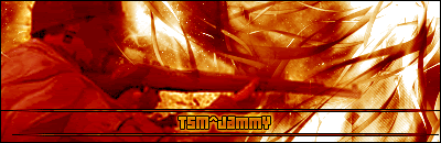
updated version
Posted: October 28th, 2005, 10:49 pm
by Neon
#TsM^JammY wrote:updated version
nice
thts definitetly better, if it were me i wouldnt have the text centered tho...i would put it in the red section - bottom left, so it would stand out more...but thts me..
Posted: October 28th, 2005, 10:52 pm
by Soviet
very nice, looks much better
Posted: October 29th, 2005, 8:52 am
by Drofder2004
Neon wrote:nice
thts definitetly better, if it were me i wouldnt have the text centered tho...i would put it in the red section - bottom left, so it would stand out more...but thts me..
Yep, great work...
And offset text is definitly better

Posted: October 30th, 2005, 9:37 pm
by Pedsdude
That's perfect
