Page 6 of 9
Re: Im gettin there...
Posted: May 16th, 2009, 12:49 am
by .:iSpawn:.
Added Border
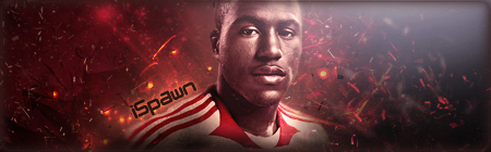
Re: Im gettin there...
Posted: May 16th, 2009, 1:25 am
by .:iSpawn:.
KillerSam wrote:I like it.
Not THAT keen on the grey / light effect in top right, but otherwise, very nice imo.
I spent like 2 hrs on just the lighting, couldnt get to look right so went with that grey.

Re: Im gettin there...
Posted: May 16th, 2009, 1:52 am
by Soviet
I like it, text doesn't quite work for me though.
Re: Im gettin there...
Posted: May 16th, 2009, 4:16 am
by .:iSpawn:.
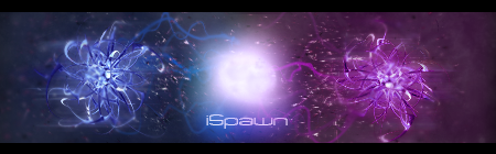
Final Version:
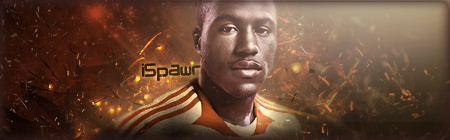
Re: Im gettin there...
Posted: May 16th, 2009, 4:49 am
by Soviet
text is a little better i guess. Looks good.
Re: Im gettin there...
Posted: May 16th, 2009, 4:55 am
by BlueDamselfly
You're getting good at making sigs spawn, nice job. Keep doing your good work

Re: Im gettin there...
Posted: May 16th, 2009, 1:38 pm
by Pedsdude
Yeah I agree, very good work!
Re: Im gettin there...
Posted: May 16th, 2009, 5:29 pm
by [SoE]_Zaitsev
I don't really like that one, but that's probably because I don't like the guy in there.
Naggers!
Re: Im gettin there...
Posted: May 17th, 2009, 1:38 am
by .:iSpawn:.
Anybody know how to create a good looking glowing ball? lol I need 1 to go in the middle of this, I tried and it
SUCKS!!!! So help on that would be much appreciated.
Other than the middle (that ima fix as soon as I can figure out how to make) what changes need to be made around the blue and pink areas?
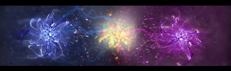
EDIT:
TRY #2 - (STILL SUCKS!)
EDIT 2:
Worked on glow a little, still needs work but is lookin more realistic.
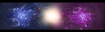
EDIT 3:
Changed middle once again, Getting alot better now!!!

Re: Im gettin there...
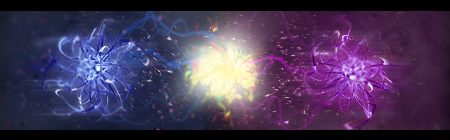
Posted: May 17th, 2009, 2:20 am
by Soviet
I'd suggest some offshoots of the white ball in various directions, also, the symmetry doesn't really look that good in my opinion.
Re: Im gettin there...
Posted: May 17th, 2009, 3:00 pm
by Pedsdude
Yeah I agree, the symmetry doesn't look good. Plus, I think the ball looks good in Edit 2.
Re: Im gettin there...
Posted: May 18th, 2009, 5:19 am
by .:iSpawn:.
Ok, So im workin on 1 more sig. Not sure where to go with it tho is the problem... Heres my start. I had to create the fake shadow and the orange area all around him. I think I did good on the floor. I have no creativity... maybe something will come to me... maybe not... any way, heres a start and any suggestions on how to start making it "Sig like" would be greatly appreciated.

and no.. there is no border yet...
I added some blur to the jeans for a little depth, i think its lookin good so far but I need a direction to go in or it will be totally wack.
- iSpawn
Re: Im gettin there...
Posted: May 18th, 2009, 8:47 am
by matt101harris
i think u should give him a mustache and some devil horns ...

I prefer your others sigs tbh:D.
Re: Im gettin there...
Posted: May 18th, 2009, 10:33 pm
by Soviet
I'd just do some brushwork all around him (and maybe a little over him). Name in the bottom left corner of course.
Re: Im gettin there...
Posted: May 20th, 2009, 2:21 am
by .:iSpawn:.
Gave up on that guy cause hes ugly... But in the mean time Ive done this
http://www.youtube.com/watch?v=vJpY3D7HhNk
View the link in the description for the High Quality image of it.
Custom Backgrounds ftw!
- iSpawn