Page 2 of 9
Re: Im gettin there...
Posted: May 1st, 2009, 12:52 am
by .:iSpawn:.
Thanks every1~!
Re: Im gettin there...
Posted: May 1st, 2009, 1:19 am
by CoDThe0neJumP
Hmm.. Awesome dude. lol i love the final project its sick yo xD

Re: Im gettin there...
Posted: May 1st, 2009, 1:22 am
by Nightmare
CoDThe0neJumP wrote:Hmm.. Awesome dude. lol i love the final project its sick yo xD
Hey Danny, nice sig, copying and pasting your directories into a url specified module.
Re: Im gettin there...
Posted: May 1st, 2009, 2:09 am
by BlueDamselfly
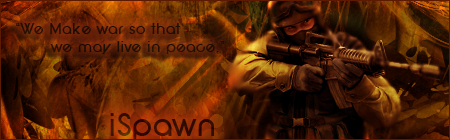
Nice sig spawn, tho, its kinda weird to see the dark guy into a super bright flashy background. but nice job
Re: Im gettin there...
Posted: May 1st, 2009, 2:49 am
by Soviet
I miss my sig

Re: Im gettin there...
Posted: May 1st, 2009, 2:09 pm
by WorldDomoNation
GJ! Now that I look at it, I think I do like the text for the quote to stick out like that, if it were blended in with the background it wouldn't be very noticable.
And I'll use your old sig if your not gunna use it anymore

Re: Im gettin there...
Posted: May 2nd, 2009, 3:11 pm
by .:iSpawn:.
Whats a way to make make the renders fit better into the background and such? I think some1 said to integrate it more with the rest... being new to this, wat are some ways to do that?
Re: Im gettin there...
Posted: May 2nd, 2009, 7:01 pm
by Soviet
Make the color of the render match the background more. Do some light brushes similar to the background over parts of the render. Fade in some of the background over the edges of the render.
Re: Im gettin there...
Posted: May 2nd, 2009, 7:04 pm
by matt101harris
i think it looks awsome
lol. I wouldnt no were to start

Re: Im gettin there...
Posted: May 2nd, 2009, 7:26 pm
by Soviet
Also, instead of trying to make the render look like the background, try to make the background look like the render.
Re: Im gettin there...
Posted: May 2nd, 2009, 10:09 pm
by .:iSpawn:.
Made another for a friend of mine ...
border is sorta bright tho...

Re: Im gettin there...
Posted: May 2nd, 2009, 10:14 pm
by .:iSpawn:.
KillerSam wrote:with a black border - that would be very good in my opinion

Like so?

Re: Im gettin there...
Posted: May 2nd, 2009, 10:47 pm
by .:iSpawn:.
Well, Ive already sent to him, and He likes, so i think im done w. it... 1 for the portfolio...
Re: Im gettin there...
Posted: May 3rd, 2009, 5:36 am
by .:iSpawn:.
Made a few more sloppy ones today, not worth posting at all... heres one that I liked except for the text. Cant seem to get it right.
However, at least ive improved alot and im extremely happy bout that
Check it out:
I dont even play css, but it looked cool. And practice doesnt hurt.
Edit: Sry i deleted all my steps throughout the topic. They just filled my photobucket account and were annoying. Sry for the "Pic has been removed" signs XD
Re: Im gettin there...
Posted: May 3rd, 2009, 6:40 am
by Soviet
that one looks the best yet imo. I think the text fits perfectly fine.