
it took 10 minutes
New Signature :D
Moderator: Core Staff
New Signature :D
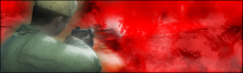
Well i got photoshop back and thought i would do myself a sig.. since i've not done one in a good 6 months...
it took 10 minutes so C&C please
it took 10 minutes
-
waywaaaard

- Core Staff

- Posts: 2214
- Joined: February 6th, 2006, 3:18 pm
- Location: Germany/Bayern
Re: New Signature :D
mh those colours don't really harmonize with each other and they aren't a good contrast - just a bad choice
shapes at itself a bit boring for me -.-
shapes at itself a bit boring for me -.-
THAT HANDS WERE NOT TRACED!
visit my blog: Link
visit my blog: Link
Soviet wrote:Yeah, watch out, Peds will hit you with his +5 D-Battleaxe of homosexuality
Re: New Signature :D
it's interesting, but it needs some work. I'm not quite sure what, but it is just kind of empty.


"Zaitsev is a cunt." - Pedsdude
-
Neon

- Too cool for CoDJumper

- Posts: 3535
- Joined: April 21st, 2005, 8:54 pm
- Location: England, Redditch
Re: New Signature :D
I think the lighter brushing on the right hand side detracts too much from the red.

"If we can hit that bull's-eye, the rest of the dominoes will fall like a house of cards...Checkmate."
"Seriously... .45k/sec it is a joke.. I could have just gone out and taken my own photos of children in this time."
"You have just become my fave youtuber!" - KillerSam in regards to myself. Win.
Re: New Signature :D
thanks for the responses guys 
to be honest i'll start working on a new one ASAP since this one basically used one C4D... and that was it?
to be honest i'll start working on a new one ASAP since this one basically used one C4D... and that was it?

Re: New Signature :D
it's not grey... it's actually transparent white if you save the image and look it's a .png  no background
Re: New Signature :D
i know 
Re: New Signature :D
Want me to change the forum theme?MickDee wrote:it's not grey... it's actually transparent white


Re: New Signature :D
lol if you think it'd make the sig look better sure why not 
Re: New Signature :D
Thought i'd add this in here... save me making a new thread
Re: New Signature :D
red doesn't go at all with the render. Render is too blurred. The brushwork is a bit monotone and without any real detail. I'd go for a grunge type font in the bottom right corner.
"Zaitsev is a cunt." - Pedsdude
Re: New Signature :D
i'll see about re-colouring it, brush work was just editing some of the brushes that come with PS.. the render is blurred because i had to cut it out myself  and it looked a bit scrappy and the blur helped clear up the edges a bit but yeah it's a work in progress
i'll mess around with colours and i'll dig out my cds with 500 odd brushes on each and 200 fonts was supposed to be grunge anyway just didn't work the way i would have liked it
i'll mess around with colours and i'll dig out my cds with 500 odd brushes on each
Who is online
Users browsing this forum: No registered users and 26 guests