Agree with the above, loose the bevel n the bird.
And also a simple 1px border to split it form the forums.
*New Forum Signatures*
Moderator: Core Staff
-
Drofder2004
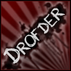
- Core Staff

- Posts: 13313
- Joined: April 13th, 2005, 8:22 pm
- Location: UK, London
jimbo, remove some of your sigs, two is ok, but four is just over kill. If you want to show all your sigs, create a topic like Kevco did.
Coding is Poetry. Mapping is Art.
"Cause im the sexiest mapper ever...except for nm, that sexy man" - Soviet
-=[CoDJumper.com Movies]=-
[Ambush] || [Backlot] || [Bloc] || [Bog] || [Broadcast] || [Chinatown] || [Countdown]
[Crash] || [Creek] || [Crossfire] || [District] || [Downpour] || [Killhouse] || [Overgrown]
[Pipeline] || [Shipment & Wetwork] || [Showdown] || [Strike] || [Vacant]

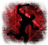
These type of signatures seem to be going well at the moment, they do tend to take a little more of my time but the outcome can be really good.
What you have here is Recoil, Flash, & Mussel flash

PS this is a nice sig, very easy on the eye... Nice blend of the 2 Kill Zone images. If I could find fault it would be the text, bit blured.... But a awsome signature WELL DONE

What you have here is Recoil, Flash, & Mussel flash
PS this is a nice sig, very easy on the eye... Nice blend of the 2 Kill Zone images. If I could find fault it would be the text, bit blured.... But a awsome signature WELL DONE

-
waywaaaard

- Core Staff
- Posts: 2214
- Joined: February 6th, 2006, 3:18 pm
- Location: Germany/Bayern
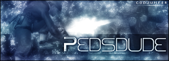
the text sucks hard here - doesnt fit in the picture and try other ways of signatures not only wow these kinds are good - try out new things maybe some brushing etcKevco wrote:These type of signatures seem to be going well at the moment, they do tend to take a little more of my time but the outcome can be really good.
What you have here is Recoil, Flash, & Mussel flash
THAT HANDS WERE NOT TRACED!
visit my blog: Link
visit my blog: Link
Soviet wrote:Yeah, watch out, Peds will hit you with his +5 D-Battleaxe of homosexuality
-
[SoE]_Zaitsev

- Core Staff
- Posts: 14220
- Joined: October 21st, 2004, 7:17 pm
- Location: Holland
- Contact:


-
Drofder2004
- Core Staff
- Posts: 13313
- Joined: April 13th, 2005, 8:22 pm
- Location: UK, London


they both look good. All you'd have to do to make the text fit in on the spiderman one is do a text color out of a random color on the sig using the dropper tool. After using bevel, emboss, or drop shadow it separates the text enough from the sig so it can be read clearly but still gives a sense of unity to it.


"Zaitsev is a cunt." - Pedsdude
I went with what you said Soviet and added a few webs to the tag, you right it does look betterSoviet wrote:they both look good. All you'd have to do to make the text fit in on the spiderman one is do a text color out of a random color on the sig using the dropper tool. After using bevel, emboss, or drop shadow it separates the text enough from the sig so it can be read clearly but still gives a sense of unity to it.

-
[SoE]_Zaitsev
- Core Staff
- Posts: 14220
- Joined: October 21st, 2004, 7:17 pm
- Location: Holland
- Contact:
-
Drofder2004
- Core Staff
- Posts: 13313
- Joined: April 13th, 2005, 8:22 pm
- Location: UK, London
Remember, always add a 1 pixel border! (At least)Kevco wrote:I went with what you said Soviet and added a few webs to the tag, you right it does look betterSoviet wrote:they both look good. All you'd have to do to make the text fit in on the spiderman one is do a text color out of a random color on the sig using the dropper tool. After using bevel, emboss, or drop shadow it separates the text enough from the sig so it can be read clearly but still gives a sense of unity to it.
Code: Select all
The first thing we want to do is create a 1px border around the banner.
- So Create a New Layer and name it "Border"
- Press CTRL+A to select all. Then go to Edit->Stroke. Apply the following Settings:
Width: 1px. Color: Black. Location: Center. Blending Mode: Normal. Opacity: 100%
Virgin Media 20Mb Broadband:
"Perfect for families going online at the same time, downloading movies, online gaming and more."
Borked internet since: 22-07-2010
-
Neon

- Too cool for CoDJumper

- Posts: 3535
- Joined: April 21st, 2005, 8:54 pm
- Location: England, Redditch
I always forget about the border ;| Does anyone actually bother naming the layers? If I don't know what one is i just hide it to see what dissapears lol.
the "Kevco" text could be positioned better I think
the "Kevco" text could be positioned better I think

"If we can hit that bull's-eye, the rest of the dominoes will fall like a house of cards...Checkmate."
"Seriously... .45k/sec it is a joke.. I could have just gone out and taken my own photos of children in this time."
"You have just become my fave youtuber!" - KillerSam in regards to myself. Win.
Who is online
Users browsing this forum: No registered users and 31 guests