opinions on new sig?
Moderator: Core Staff
-
Drofder2004

- Core Staff

- Posts: 13313
- Joined: April 13th, 2005, 8:22 pm
- Location: UK, London
Re: opinions on new sig?
Test needs a little work, might just be a little too big though. But background and visuals are good.

Virgin Media 20Mb Broadband:
"Perfect for families going online at the same time, downloading movies, online gaming and more."
Borked internet since: 22-07-2010
-
Neon

- Too cool for CoDJumper

- Posts: 3535
- Joined: April 21st, 2005, 8:54 pm
- Location: England, Redditch
Re: opinions on new sig?
Because of the extra shine etc on the cars, it makes the background layer look a little plain. Maybe add some suble multicolouring or something, dunno. I like it overall though.

"If we can hit that bull's-eye, the rest of the dominoes will fall like a house of cards...Checkmate."
"Seriously... .45k/sec it is a joke.. I could have just gone out and taken my own photos of children in this time."
"You have just become my fave youtuber!" - KillerSam in regards to myself. Win.


Re: opinions on new sig?
Put more work on the text, and change font as well. Background looks sweet, although I am suspecting that you just googled "super cool cars" and pasted the picture in on Photoshop. If not, then it's great  (except for the text)

-
[SoE]_Zaitsev

- Core Staff
- Posts: 14220
- Joined: October 21st, 2004, 7:17 pm
- Location: Holland
- Contact:
Re: opinions on new sig?
Not bad. I have to agree with the others, change the text 
matt101harris wrote:big cock was the first thing that came to my head lol
Re: opinions on new sig?
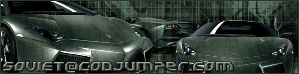
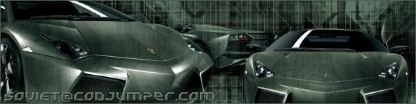
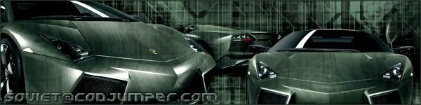
No, I googled Lamborghini Reventon, downloaded about 8 different images and hand rendered each one seperately. Then, I made the background with brushes and pasted them in with resizing until it looked good. Then, I pasted layers of the background on top of them, gave them soft light blending, and used the displace tool with a black & white bumpmap of the cars on the background image to make it kind of look like the car is reflecting the background as best I could. It took me about four hours.helium wrote:Put more work on the text, and change font as well. Background looks sweet, although I am suspecting that you just googled "super cool cars" and pasted the picture in on Photoshop. If not, then it's great
how's this?
1.
2.


"Zaitsev is a cunt." - Pedsdude
-
Drofder2004
- Core Staff
- Posts: 13313
- Joined: April 13th, 2005, 8:22 pm
- Location: UK, London
Re: opinions on new sig?
1
Virgin Media 20Mb Broadband:
"Perfect for families going online at the same time, downloading movies, online gaming and more."
Borked internet since: 22-07-2010
Re: opinions on new sig?
Still, I think you should change font. And try to mix around with the bevel and emboss settings a little more. Other than that it looks cool
http://www.1001freefonts.com/
http://www.1001freefonts.com/
-
[SoE]_Zaitsev
- Core Staff
- Posts: 14220
- Joined: October 21st, 2004, 7:17 pm
- Location: Holland
- Contact:
Re: opinions on new sig?
I prefer the second one tbh, it's a little darker.
matt101harris wrote:big cock was the first thing that came to my head lol
Who is online
Users browsing this forum: No registered users and 18 guests