
Posting now all future work in this thread so i don't need to create a new topic all the time...
Recent work: warning stripe
Worked: few hours (finished)
Res: 1024
E: Resized preview to 512(more forum-friendly size)
DOWNLOAD
DOWNLOAD
Advising criticism, please!
BatterY's graphics thread
Moderator: Core Staff
BatterY's graphics thread
You do not have the required permissions to view the files attached to this post.
Last edited by BatterY on July 26th, 2010, 1:50 pm, edited 2 times in total.
-
Rezil

- Core Staff

- Posts: 2030
- Joined: July 24th, 2006, 11:21 am
- Location: Cramped in a small cubicle/making another jump map
Re: BatterY's graphics thread
Too big. 
Nah it looks alright, perhaps the yellow goes more towards the green side and not the orange one if you nkow what I mean.
Nah it looks alright, perhaps the yellow goes more towards the green side and not the orange one if you nkow what I mean.
Drofder2004: Drofder's rules for reviewing a map
[...]
#5 If your name is Rezil, minimum 5/5.
---
<LT>YosemiteSam[NL]:
I heard somewhere that the best way to start is juggling 2 balls with one hand, so you will get a feel for it.
[...]
#5 If your name is Rezil, minimum 5/5.
---
<LT>YosemiteSam[NL]:
I heard somewhere that the best way to start is juggling 2 balls with one hand, so you will get a feel for it.
Re: BatterY's graphics thread
Looks good, although the cloud pattern that is visible on the yellow might be a little too obvious.


"Zaitsev is a cunt." - Pedsdude
Re: BatterY's graphics thread
I trust in you when it comes to graphics, so what should I do to it make more realistic? Add opacity?Soviet wrote:Looks good, although the cloud pattern that is visible on the yellow might be a little too obvious.
Re: BatterY's graphics thread
Well the could pattern is consistent throughout. By that I mean you can see it carry over between the black stripes. To make it look a bit more 'realistic', I would partially erase some of the cloud layer randomly on each yellow strip so that the pattern doesn't carry over directly. That will keep the unity of the stripes based on color and general pattern, but make the black act as more of a separation and appear as less of an overlay onto the yellow. I hope that makes sense, it's hard to explain.
"Zaitsev is a cunt." - Pedsdude
Re: BatterY's graphics thread
Well, my goal was to make something similiar to this from a scratch:

What I understood from your comment is to make some yellow over black and vice versa?
What I understood from your comment is to make some yellow over black and vice versa?
Re: BatterY's graphics thread
Ahhh yes, now I understand. Will do that. =)KillerSam wrote: I think soviet is saying to make each stripe seperately, rather than make a large square and then put black over it.
Basically, so that the yellow areas are all unique and there is no pattern going between stripes. (e.g dirt marks going from one stripe to the next).
I don't see the point of doing this however.
When I merged the stripes the cloud pattern, I made white to transparent. Don't ask me why, it just looked fine at the time o.O
In the meantime, some other crap:
You do not have the required permissions to view the files attached to this post.
Re: BatterY's graphics thread
It looks fine to somebody who has never used photoshop, but if you've messed around with it at all it is glaringly obvious how it was made and it makes it look a bit elementary.KillerSam wrote:I don't see the point of doing this however.
Very nice fire, how did you make it?
"Zaitsev is a cunt." - Pedsdude
Re: BatterY's graphics thread
Not really, while dirt may be consistent to an extent it probably wouldn't follow the repetitious pattern created by the cloud filter.
"Zaitsev is a cunt." - Pedsdude
Re: BatterY's graphics thread
ThanksSoviet wrote:Very nice fire, how did you make it?
GIMP 2
1. Gradient > germany flag smooth (black, red & yellow)
2. Smudge tool > create the base of the flames
3. Filters > Distorts > IWarp --> Rotate (yes, rotate) all flames first CCW, and then CW
4. New Layer
5. Filters > Render > Clouds > Plasma
6. From the layer window, overlay the plasma layer to the flame one
Done!
and if I remember right, someone made a tut about it.
And today I was bored...
No idea how to make it look better...
You do not have the required permissions to view the files attached to this post.


Re: BatterY's graphics thread
Edit: NVM...
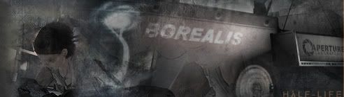
Here's a widescreen wallpaper that screams for text but I couldn't think of anything that looks good.
http://img822.imageshack.us/img822/6523/wallpapervb.png
Here's a widescreen wallpaper that screams for text but I couldn't think of anything that looks good.
http://img822.imageshack.us/img822/6523/wallpapervb.png
Re: BatterY's graphics thread
Bump, since edit button doesn't.
Who is online
Users browsing this forum: No registered users and 41 guests